Visual Art
- Farmboy Playlists
- Photography/Photo Manipulation (Abstract Photoshops)
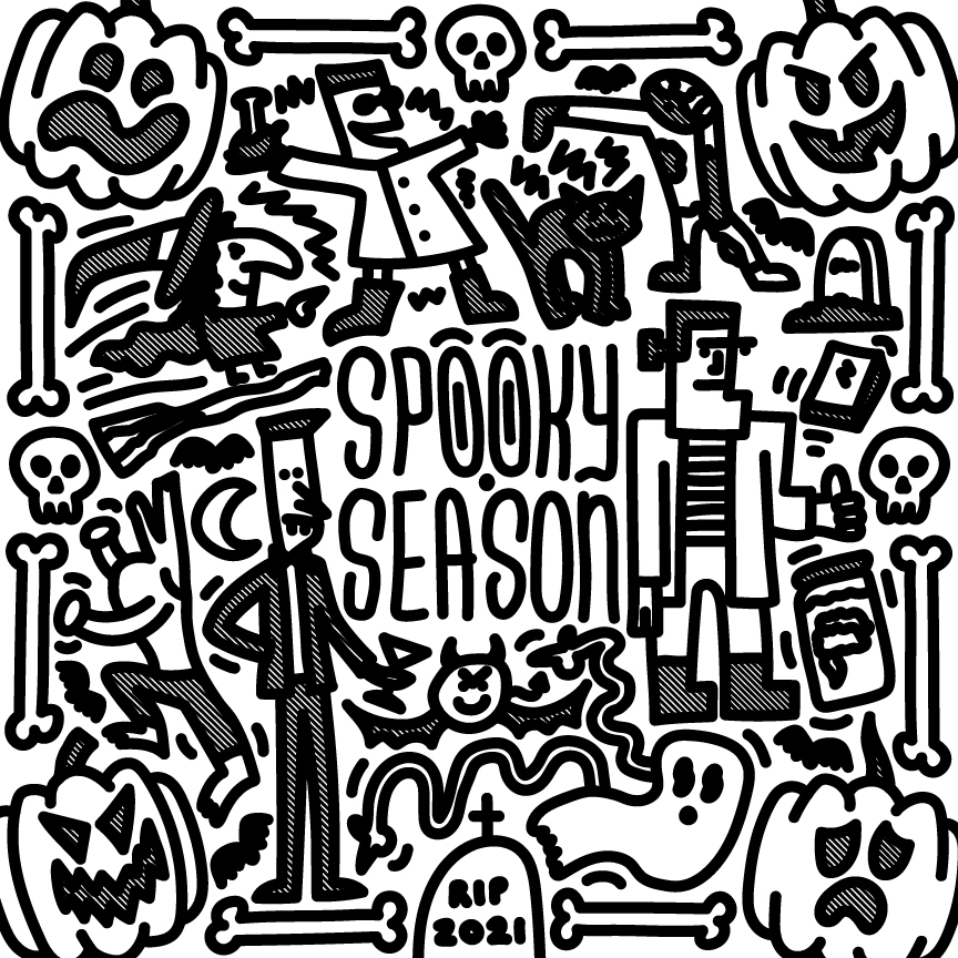
- Illustrations
- Paintings
- Inspiration (Artists That Inspire Me)
- Dr. Seuss
- Keith Haring
- Basquiat
- El Huervo
- Andy Warhol
- Pablo Picasso
- Vincent Van Gogh
- MC Escher
Staples Office Chair
An office chair given new life. What would you do with a cool office chair?
ADAI Amusement Park Theme
A theme centered around boardwalk attractions and thrilling, creative rides! Being on the ADAI Board came with many responsibilities, and the biggest one by far was that with each new year came a new Exhibit Theme. The creative mastermind behind this theme was none other than Zach Kern, but that is not to say that I did not play a crucial part in helping him see his vision through to the end. All the various deliverables turned out looking great, and I am glad that Zach got to finally see his dream come to fruition of creating and owning the theme for an ADAI Exhibition.
Jane & Jo Logo
A logo for a [whatever type of business]. This is the final version of the logo we created for a brand.
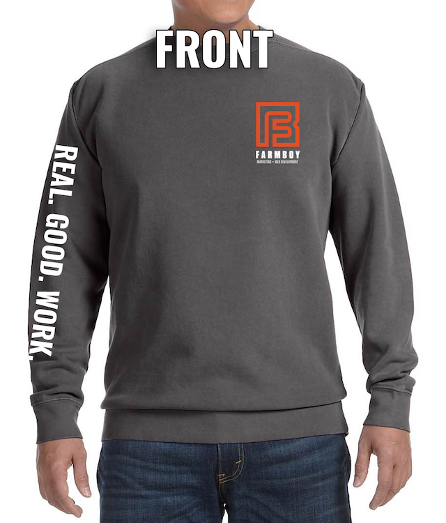
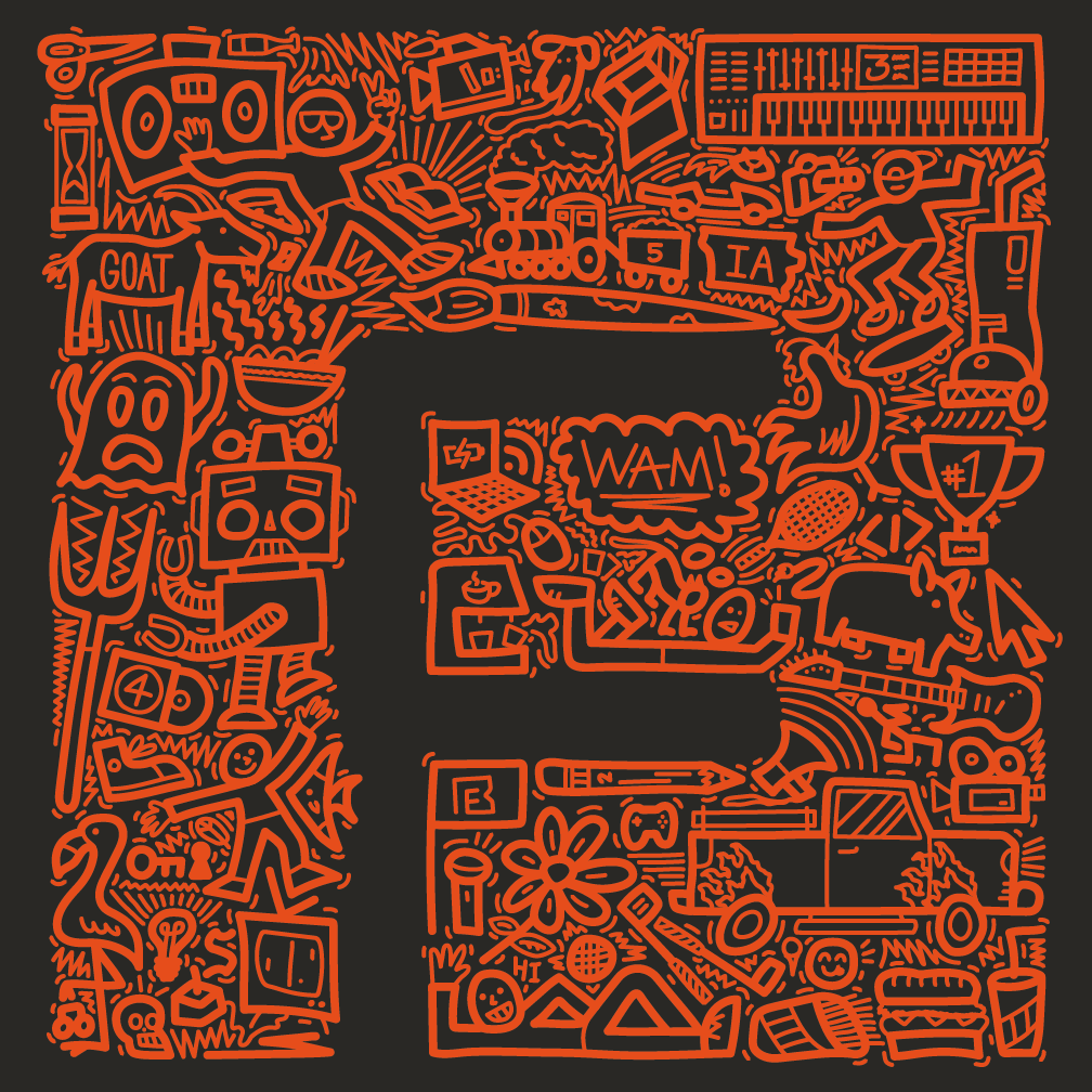
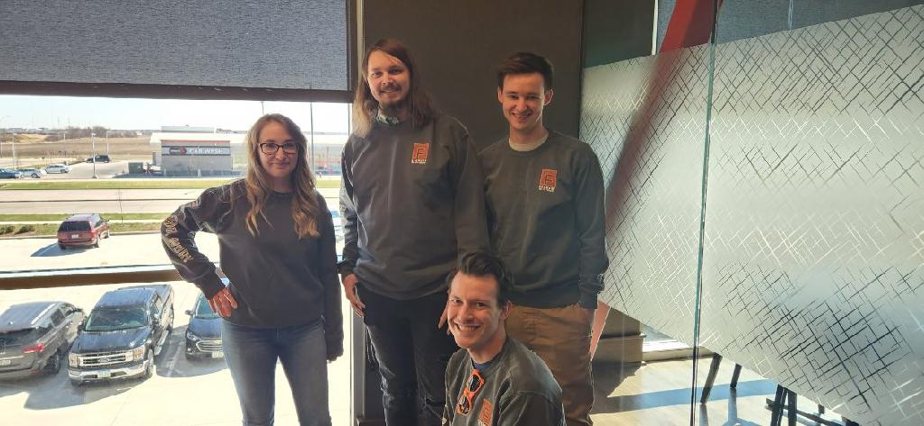
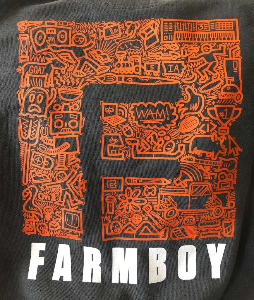
Farmboy Sweatshirt Design / Illustration
A fun but labor-intensive sweatshirt design made with a very special team in mind. Around the beginning of 2023, there was talk around the Farmboy office about a very important company-wide meeting that was coming up in a few months. As a way to show employees some gratitude for such great work, the idea of gifting Farmboy merch was floated around. I had been wanting to design a cool Farmboy shirt since my first day on the job, and now I had my opportunity to shine!
I wish I had my initial sketch from 2019 on hand. I am sure I still have it somewhere, but I cannot find it for the life of me. Please enjoy these crude mockup renditions I had to create for the team instead!
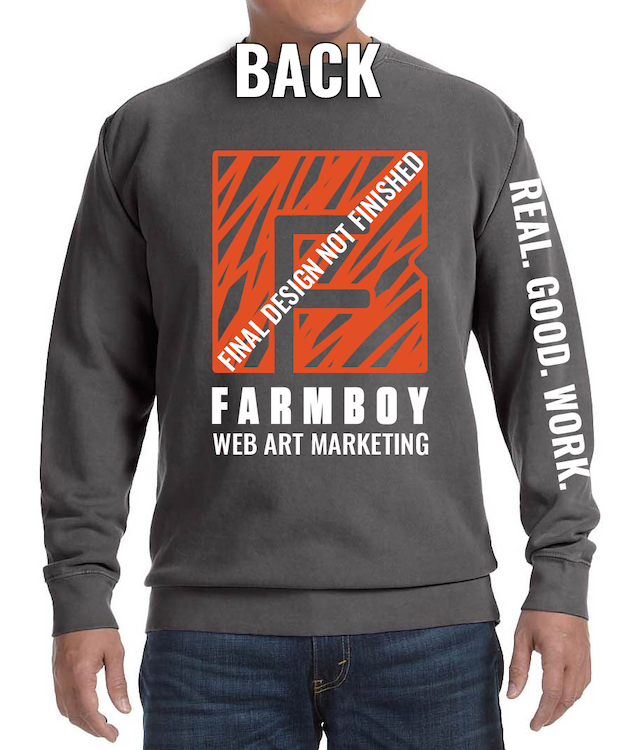
Back Design
Front Left Chest Design
Sleeve Design Close Up
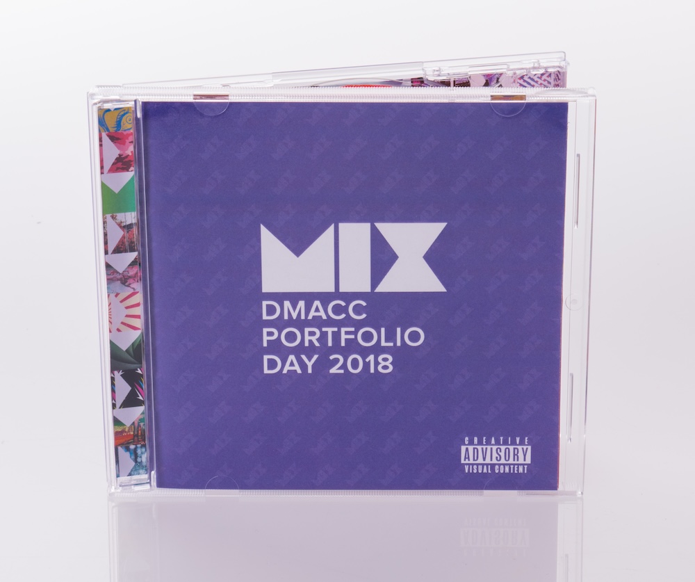
MIX CD Invite (DMACC Portfolio Day)
An invite to an event that you won’t just throw away? Sounds like music to my ears! I was fortunate enough to have my theme idea picked for the 2018 DMACC Portfolio Day. The word we centered everything around was “MIX” and it was all about the music (what a surprise coming from me). When it came time to create the invite that would be sent out to design agencies and professionals across the Des Moines Metro, I knew it had to be something related to one of the mediums that people use to spread their music out into the world. Should it be some sort of vinyl record imitation? I did the math, and pressing real records would be too expensive. Maybe a cassette case with a tape inside? Recording over that many tapes in such a short time is not feasible. In the end, we went with the classic (and my personal favorite): a clear jewel case CD.
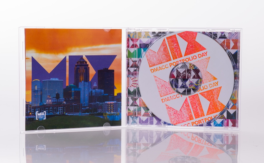
I designed the front, back, and inside booklet for the jewel case, which was something I wanted to do for a long time up to that point. Each CD label sticker was personalized with a unique stamp pattern (shout out to Blair for the stamp idea).
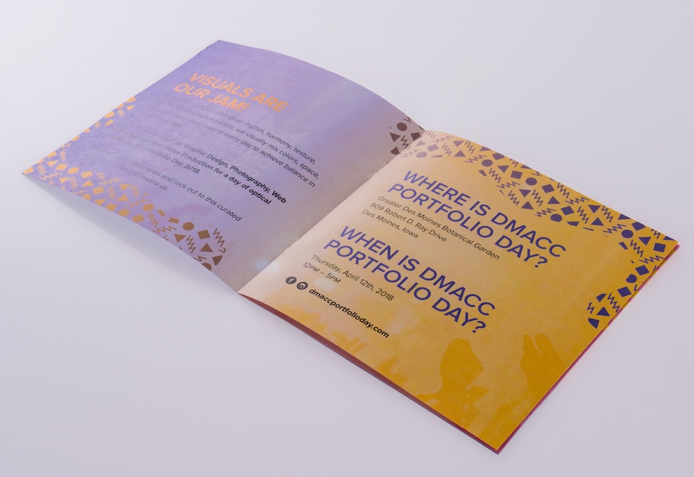
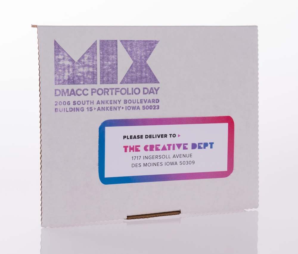
All the CDs actually had the music listed on the back burned onto each one! I was even approached at Portfolio Day and told by someone that they loved their “MIX” CD Invite so much, that they had it in their car to jam out to. I have embedded the playlist version here if you’d like to give it a listen!
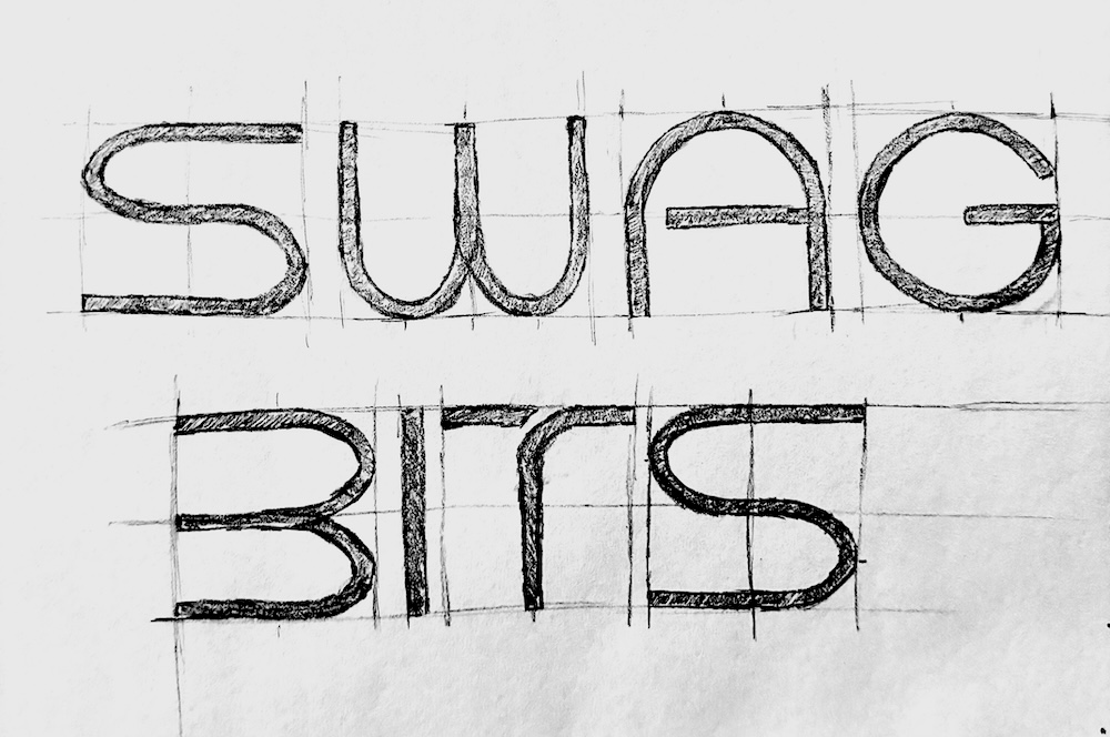
SWAG BITS Logo
A logo design currently in the making! Right now, I am finishing up the final vector art for this logo. I confirmed with the client, and they gave the “ok” to share some of the process through the sketches I have made. The biggest concern the client brought up to me, was that they want to appeal to a specific demographic through the appearance of professional and clean minimalism. A lot of people within their same market go for a more fun and nostalgic vibe, hence the desire to stand out and be different.
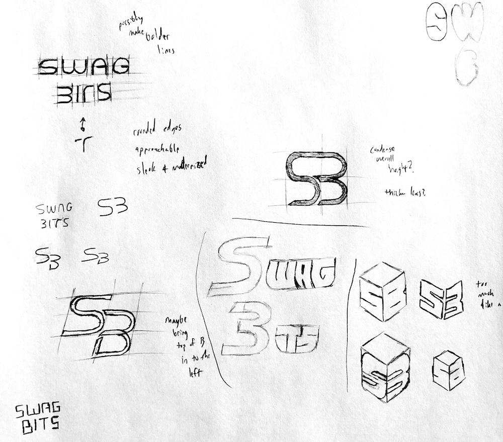
This first image shows the general sketches and ideas that I had created after meeting with the client to discuss their brand direction and identity. This second image shows the more refined sketch of the logo icon they decided to go with.
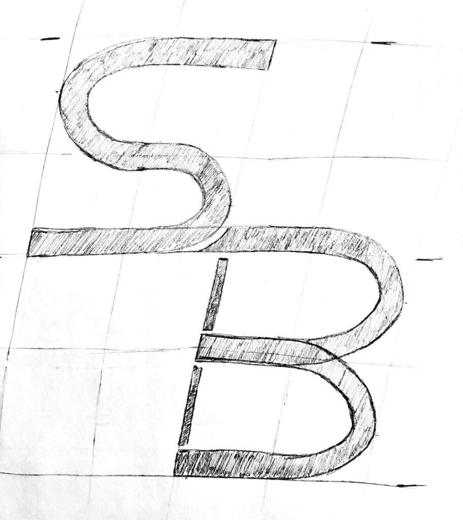
This final image shows the refined sketch of the text portion of the logo. I am very excited to vectorize this logo. I have always had a love for creating my own letterforms within Illustrator, and it’s something I have not gotten the chance to do in quite some time!
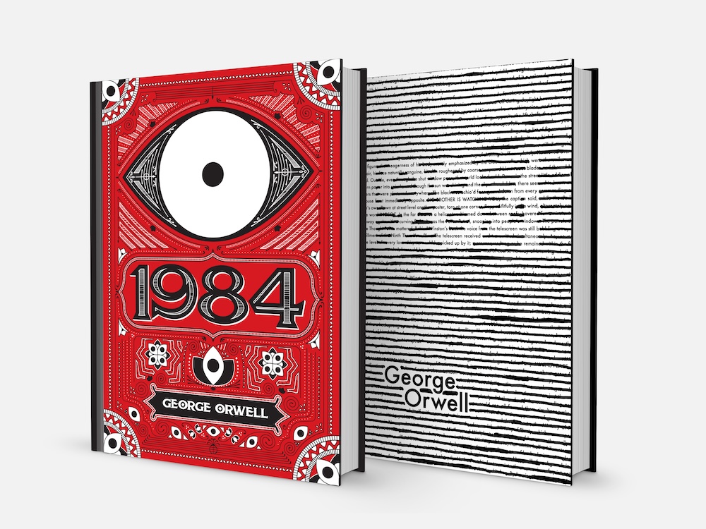
1984 Book Covers
Two book cover designs, in drastically different styles, for one book. I feel like this project displays my versatility with design quite nicely. One cover is in the style of a “Victorian” design, while the other is going for more of a “Minimalist” style. One of the lessons I learned from this project: You can either work on a design for hours and hours on end, hoping that it comes out looking good, OR you can come up with a clever concept and have a good design done in 5 minutes. Don’t get me wrong, it is a great skill to have to be able to create the “Victorian” cover, and it certainly looks really cool. But on the other hand, I made the “Minimalist” cover on a drastically shorter timeline, and that is the cover that ended up winning the most people over. The ideas and concepts behind the design matter more than just “brute-forcing” a design out.
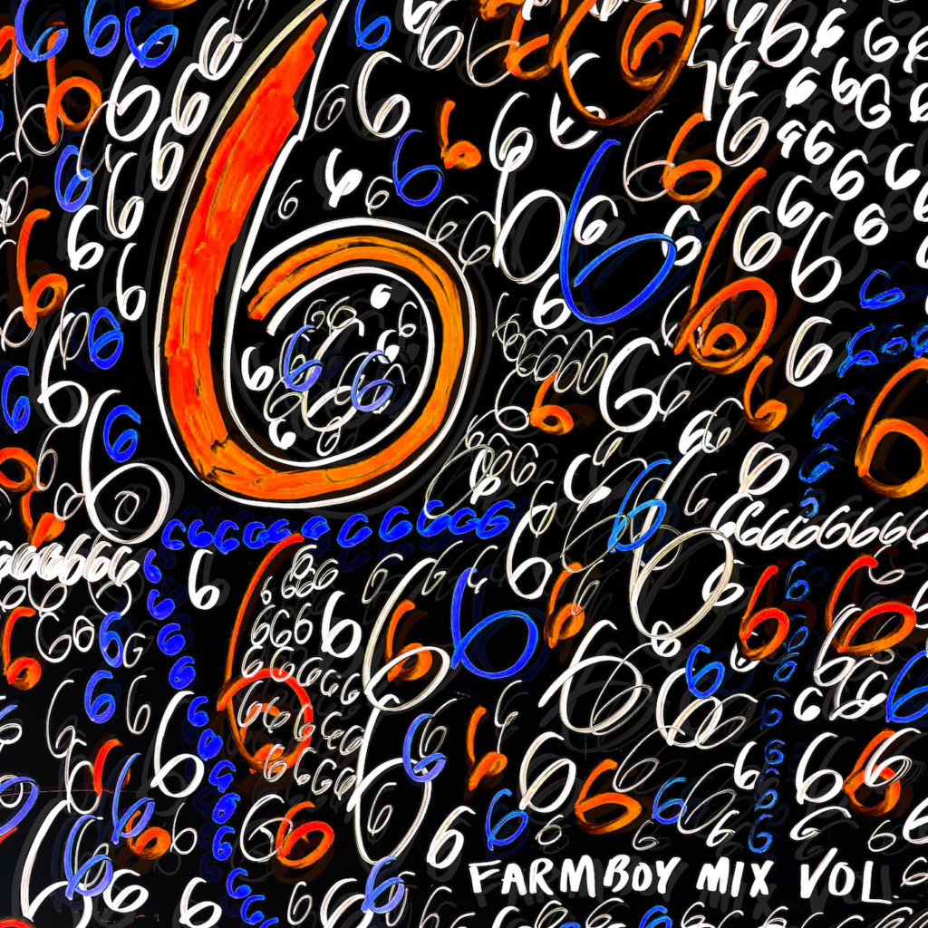
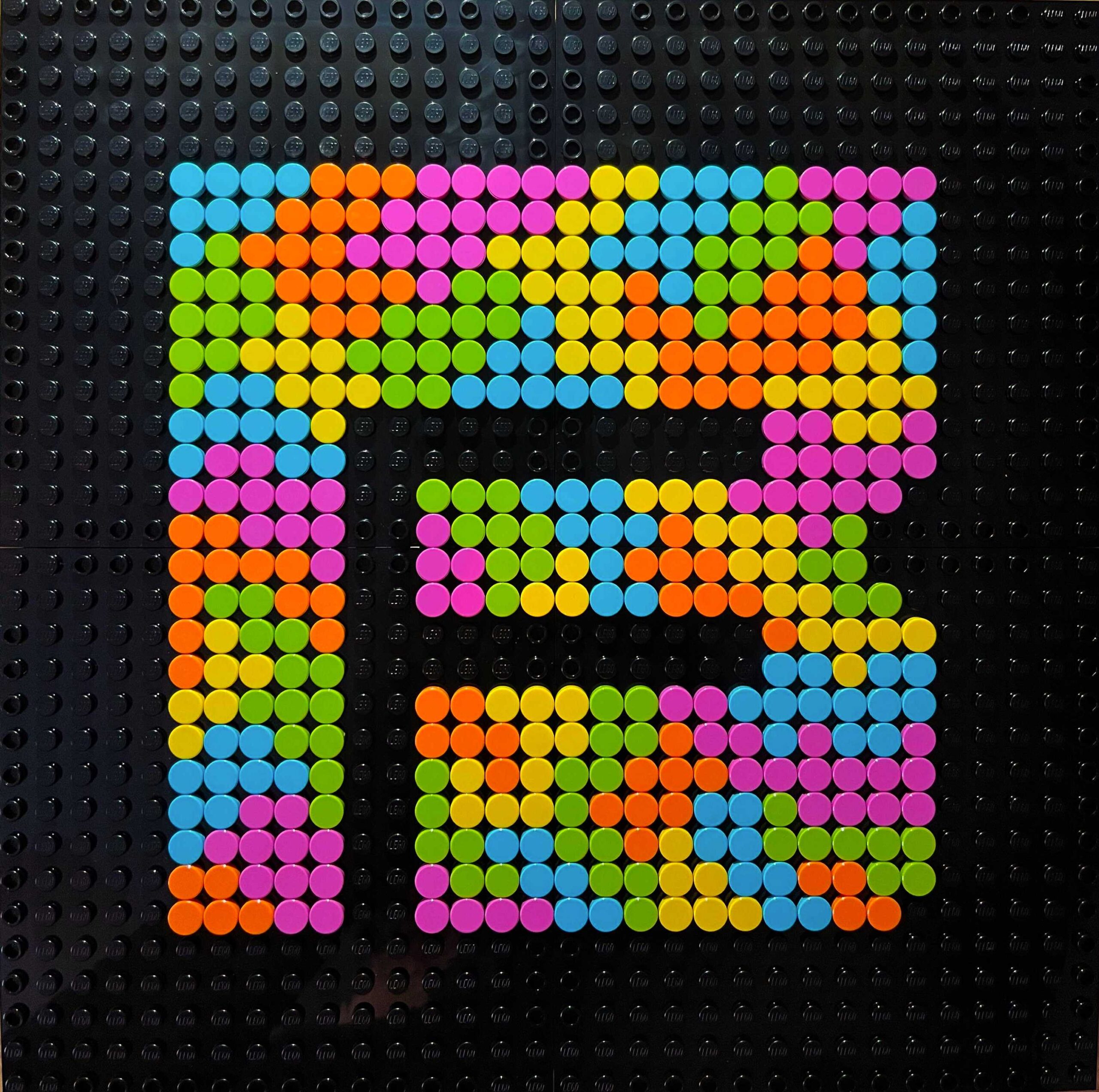
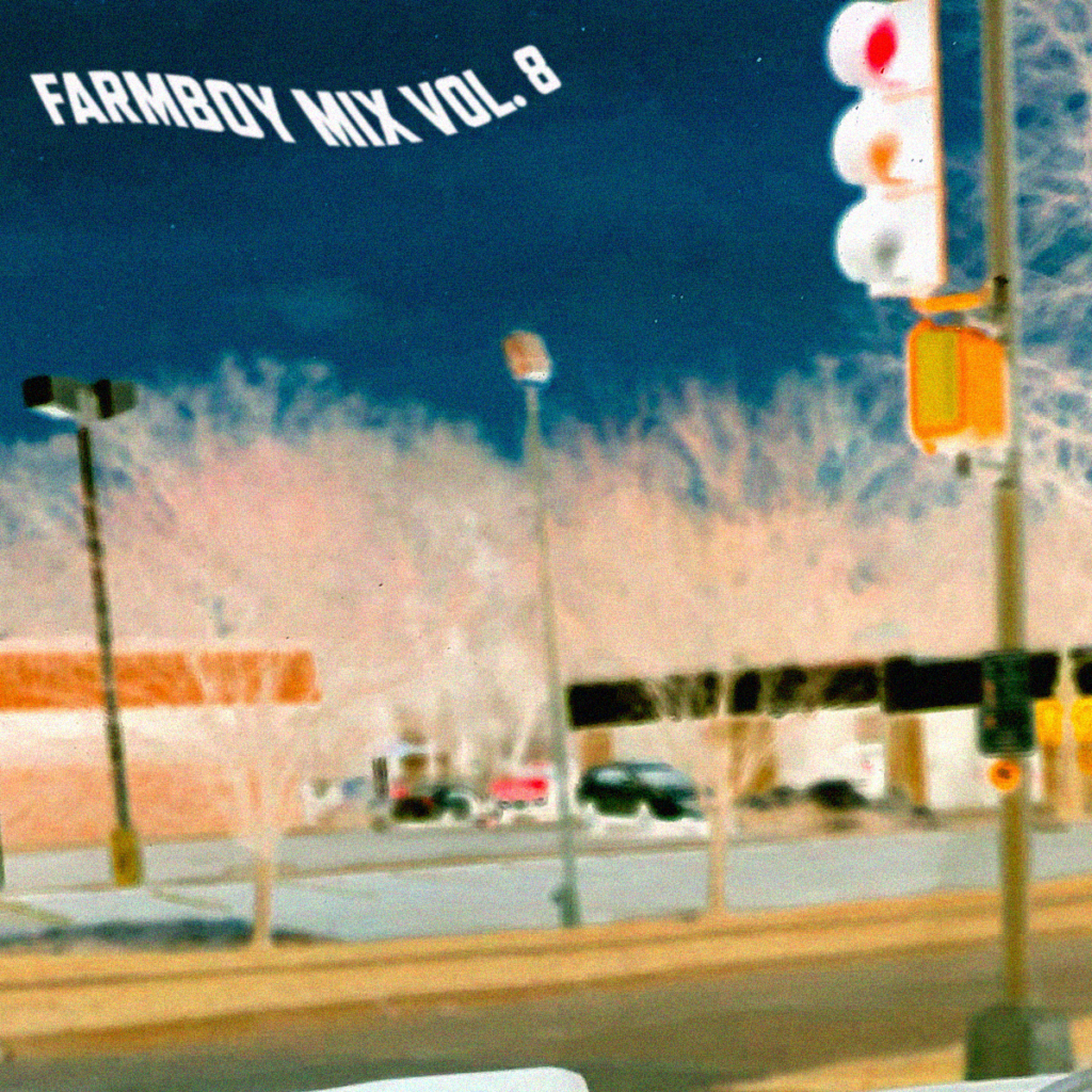
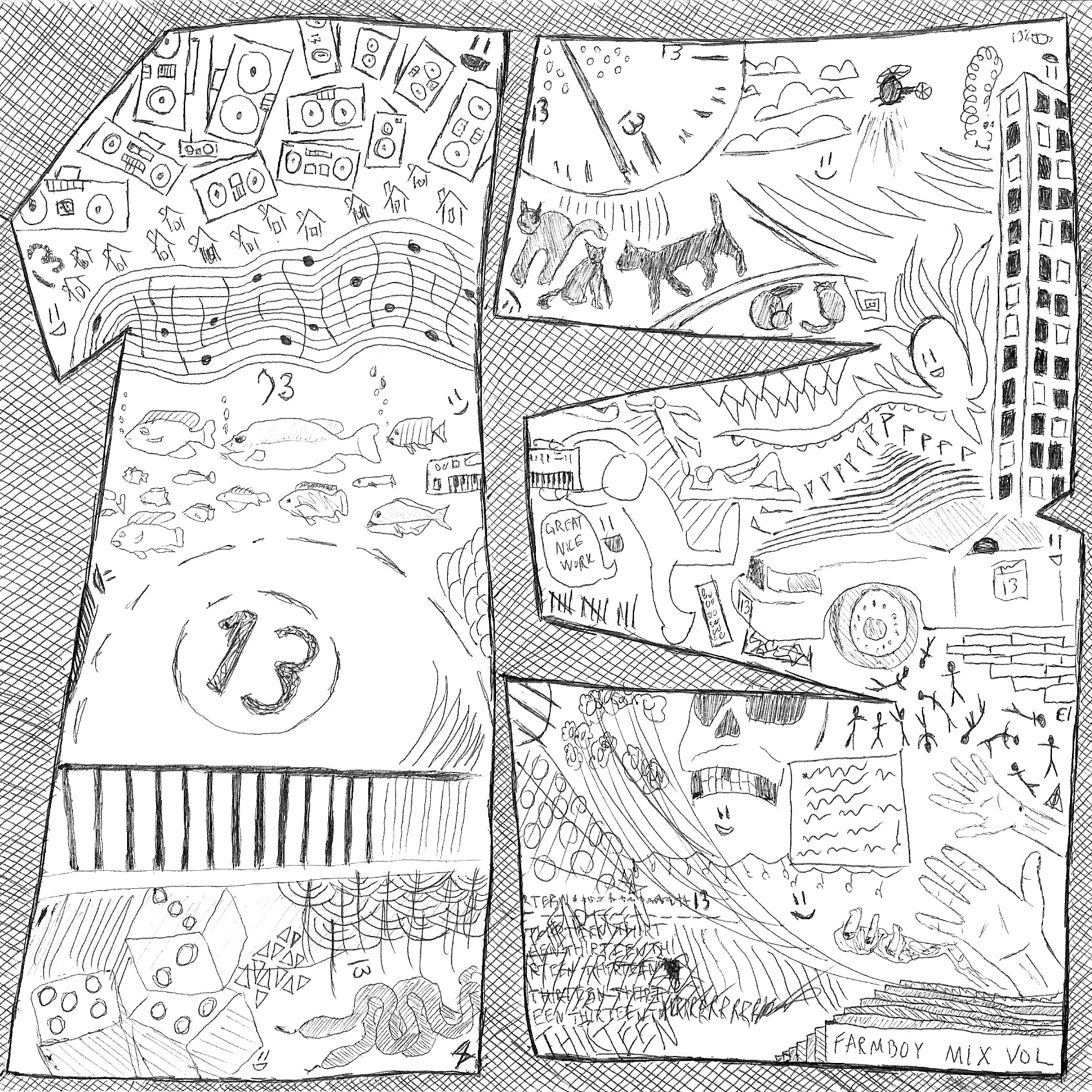
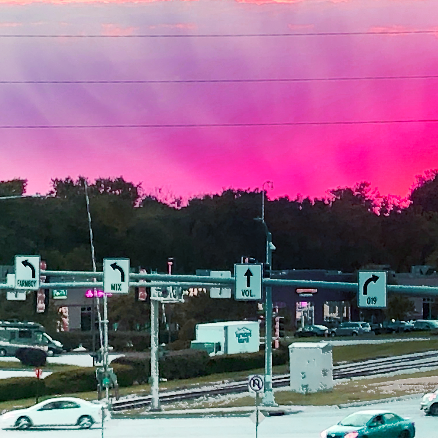
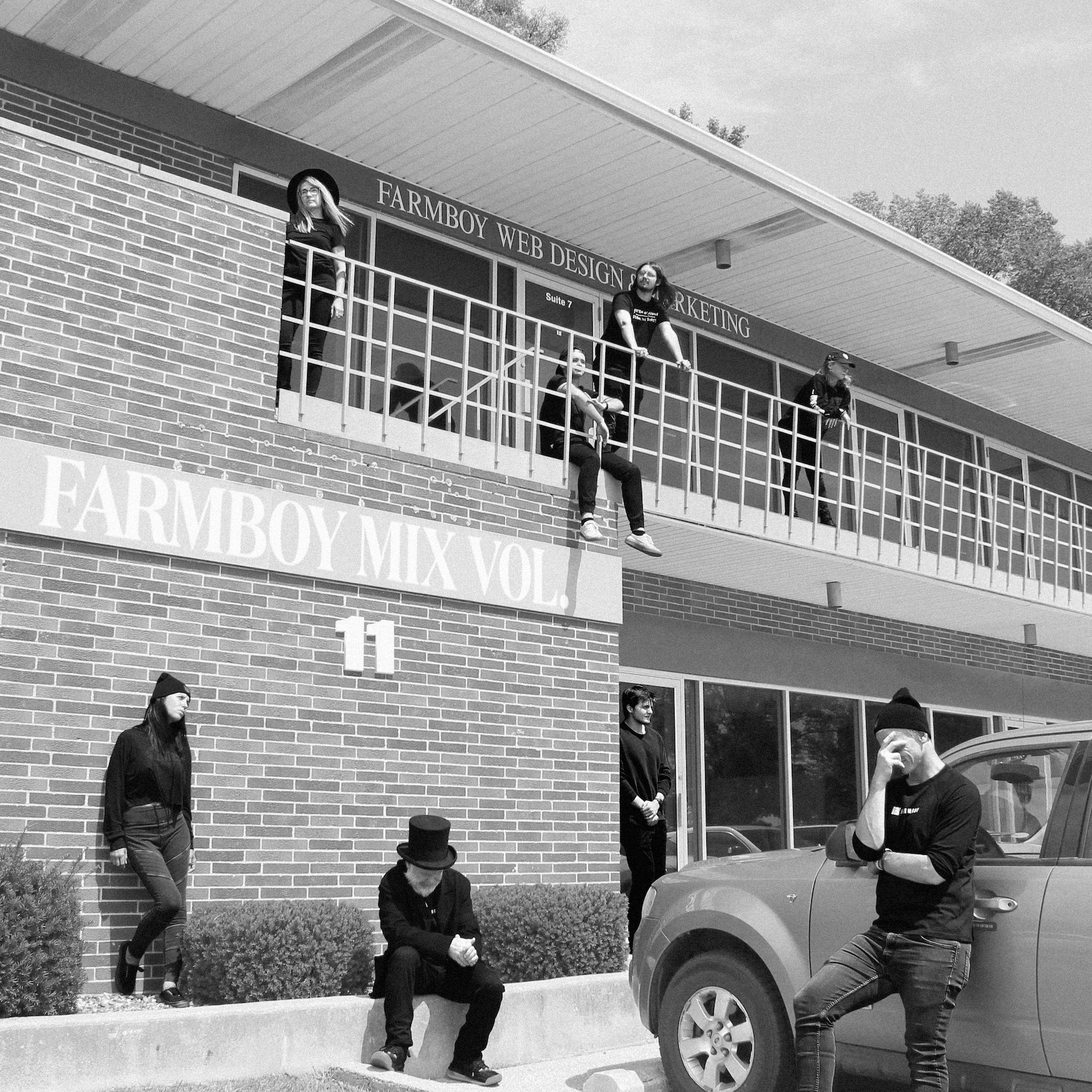
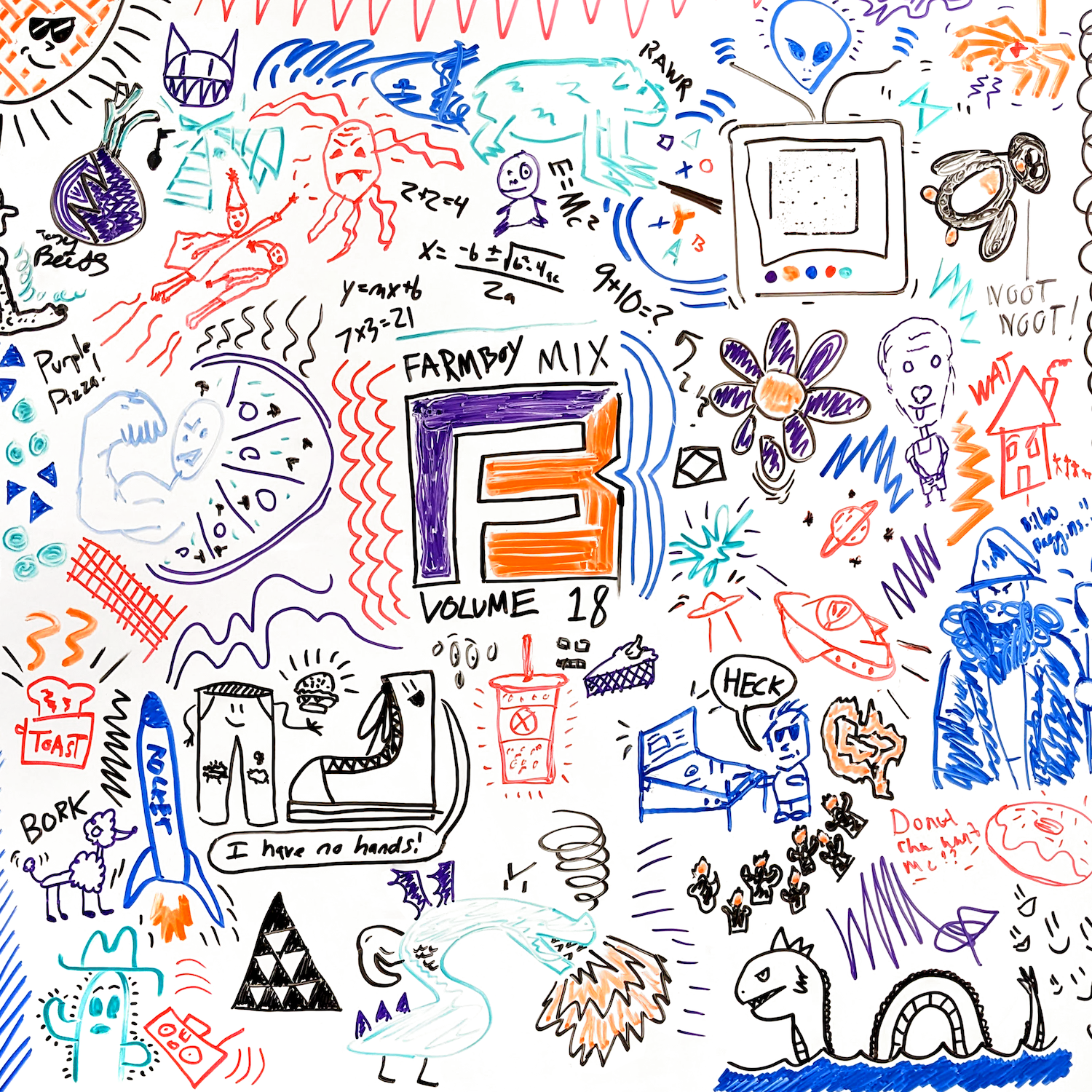
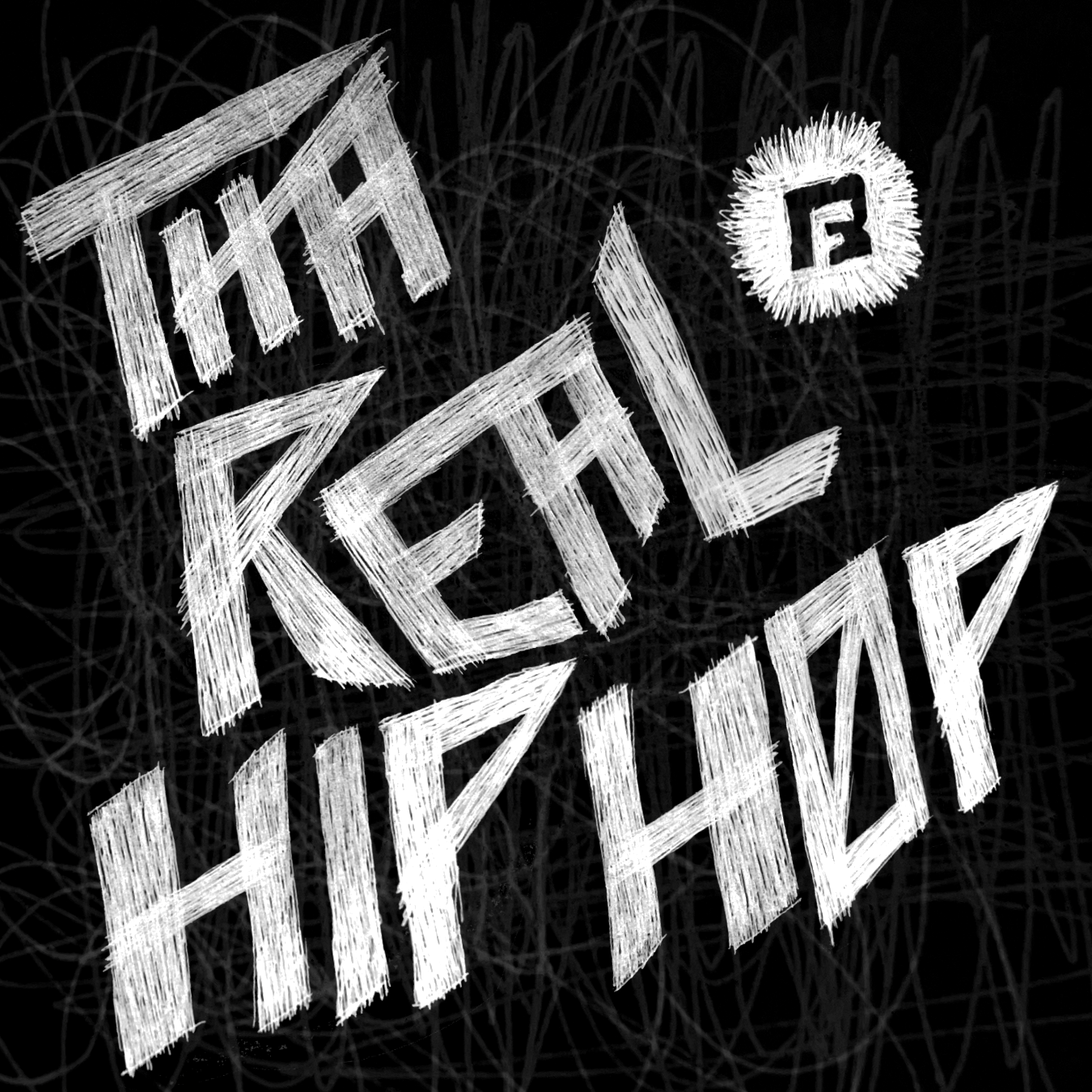
Farmboy Playlist Covers
Various covers created for the Farmboy Playlist Series. Each month there is a new playlist, and every other month there is a specific theme. Each cover is creatively masterminded by myself, and some include artistic contributions from other team members (Farmboy Mix Vol. 18). What is displayed below is only a handful of the playlist covers.
Wedding Invites
An invite design for a very special day in my life. I feel like it’s pretty commonplace amongst other designers, that designs created for yourself come much easier and with fewer challenges than a design created for a client. While I would normally enjoy a good challenge, it’s probably better that this one was less taxing on me, given that I had much bigger things to worry about. That being said, would I want to do a design like this again? Yes, I really enjoy designing items like this for special events! Would I want to go through and do my whole wedding again?… No, planning for everything else was more expensive than I could have imagined.
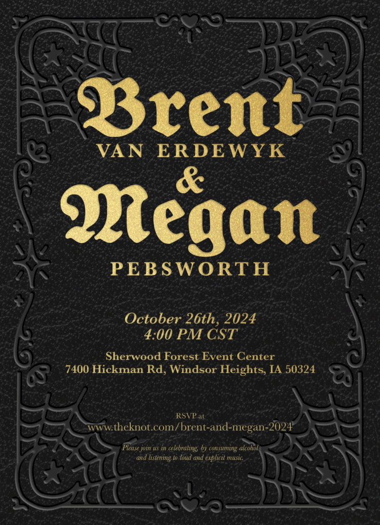
Wedding Invite Front Design
Wedding Invite Back Design
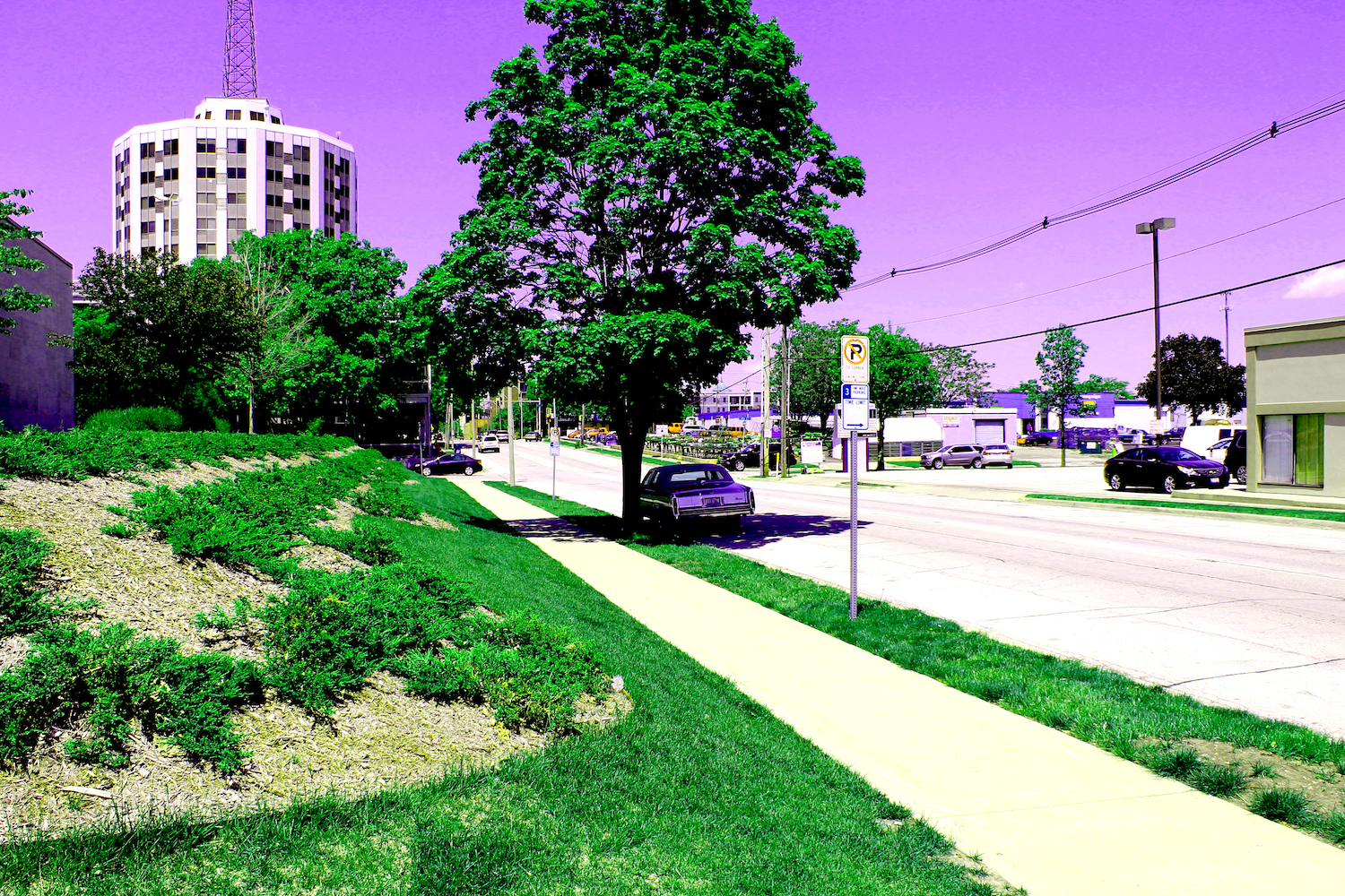
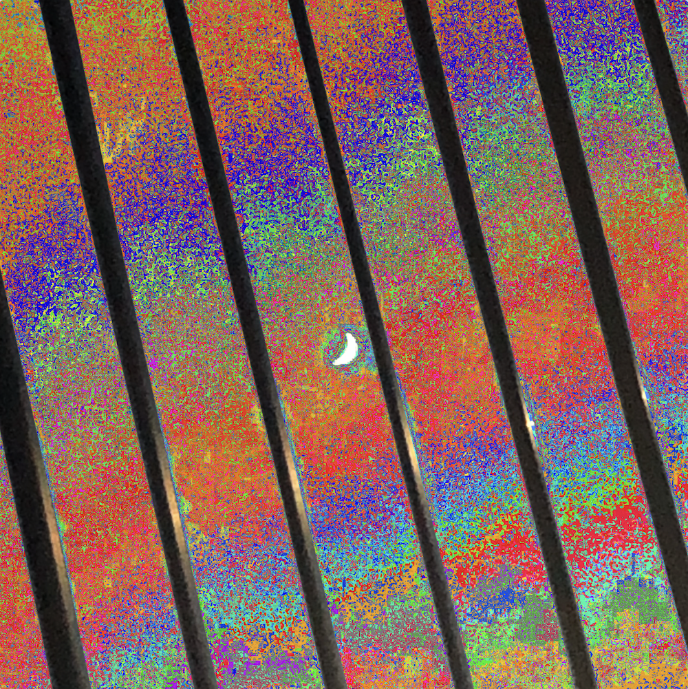
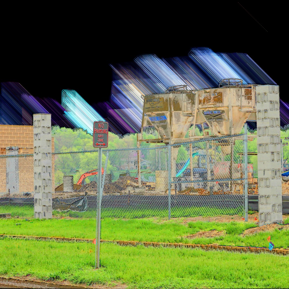
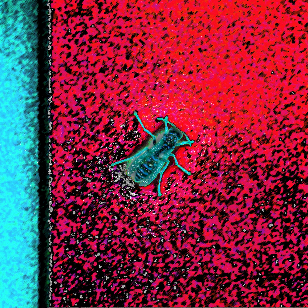
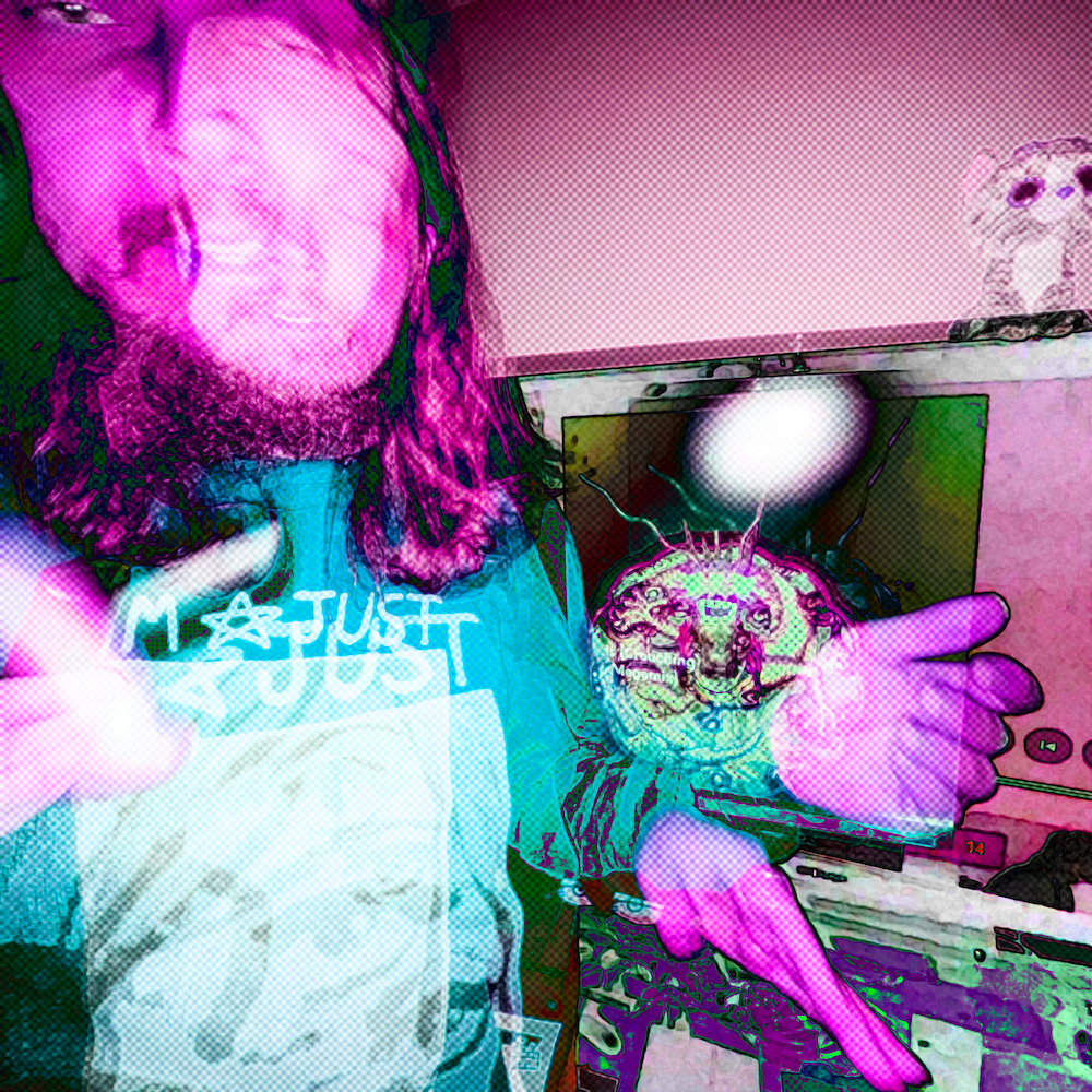
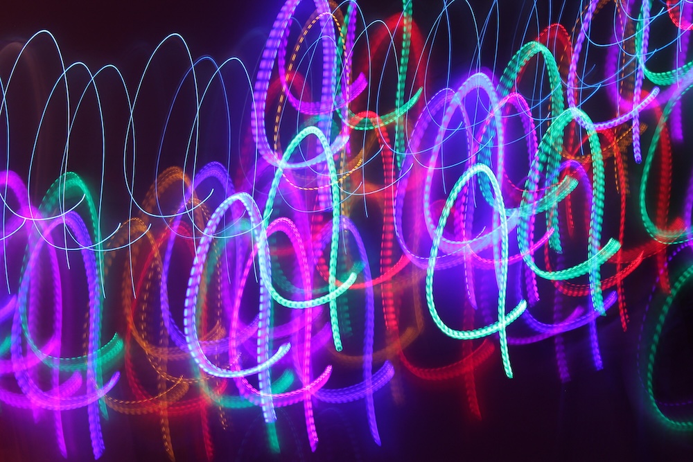
Photoshop Art
Photoshop creations for my own enjoyment and artistic fulfillment. With every piece I make, I try to craft something unique and original. I never want to create the same thing twice. I find it interesting how, when different people look at these pieces, they all seem to point out different elements that stand out to them. I suppose that is just their artistic preferences showing through in what they pick, which is quite fascinating to me. The ones I have chosen to display below are my personal favorites. More can be found on my Instagram.
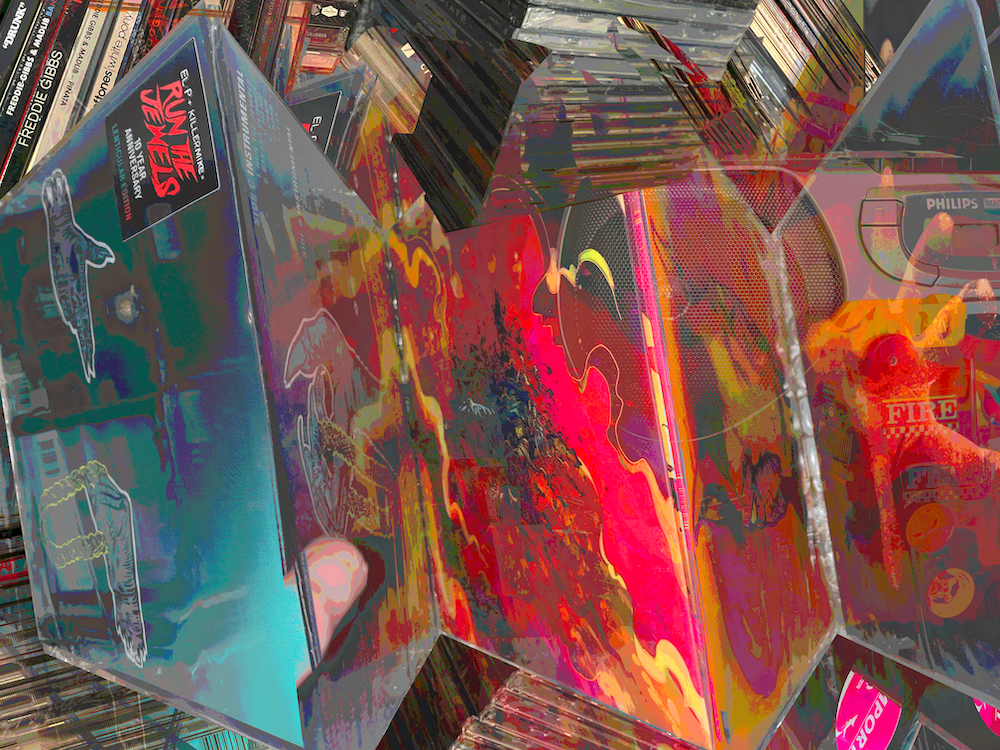
Pink bday (1)Pink bday (2)<color chain>Rooster (pic is already on the site but this is a different edit)Never ending pursuit to find satisfaction (vinyl and cds)- Cognitive dissonance
Night sky (glitchy night sky one)- Postage wanted
- Jaws of life
- Display your dissatisfaction
- Cranial combustion
- Payment please
- Golf series
- Art of being docile
- Huxley church
IdiosyncrasyTranquility (tree in carroll)- All of this beauty
- Light of god
- Sadface (previous slack profile)
- Color lights
- Tower
DIRTY- converse shoes
- Canyon one from Jack
- The one i framed for Jack (buildings)
- bird
- window with the flowers over the top of it
- traffic light
- car (jack)
- Shitty album cover
- (Maybe some unreleased ones too)
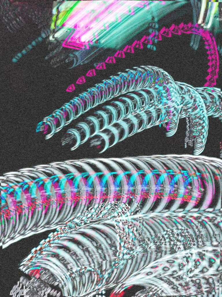
Idiosyncrasy
DIRTY
(img-4380_dirty.png)
Gazed & Wazed
(img-5671.png)
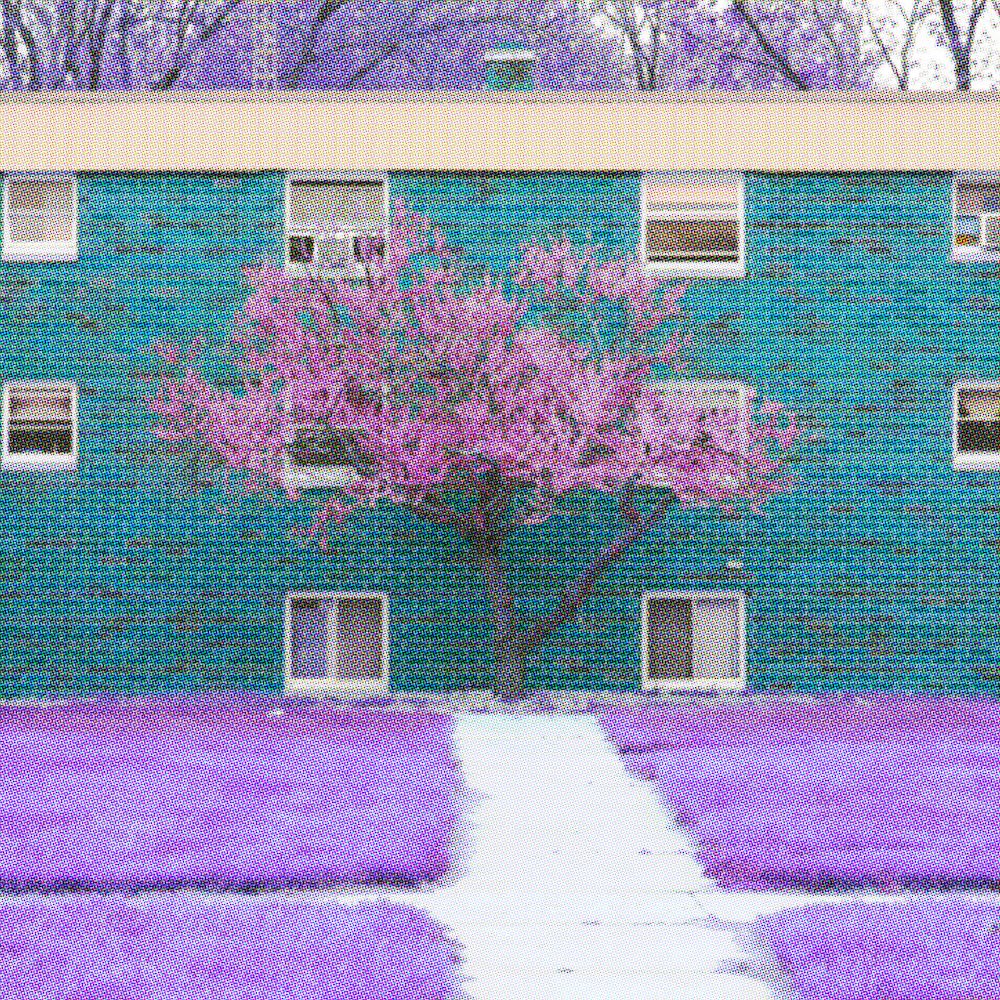
Tranquility
(under-the-peace-tree.jpg)
<%> COLOR CHAIN <%>
(img-6728-11.jpg)
Night Sky
(img-9193.png)
Never-Ending Pursuit to Find Satisfaction (Overconsumption Is Ruining Me)
(img-6599.png)
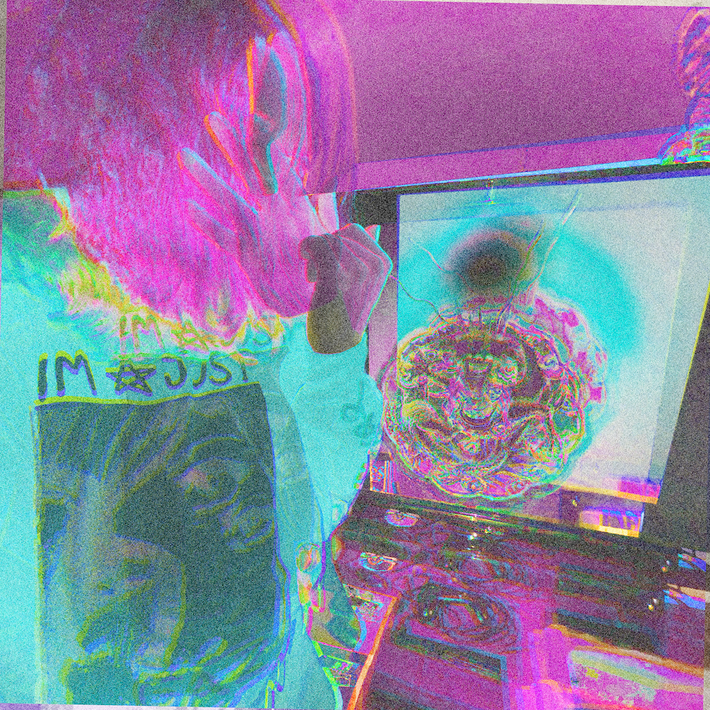
Dazed & Fazed
(img-5681.png)
IMG_9169
(img-9169.JPG)
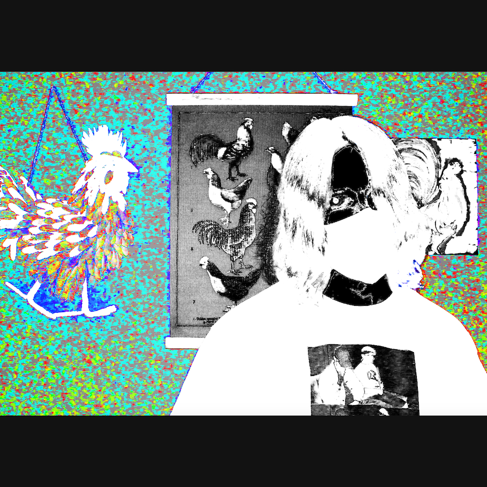
Rooster
(img-4332_edit_spotify-cover.png)